Color is an essential element of landscape design that influences mood, perception, and visual balance. When applied effectively, color contrast can transform ordinary landscapes into stunning and inviting spaces. This guide will explore techniques for creating impactful color contrast in landscape design, including plant selection, layout, and seasonal variations.
Understanding Color Theory in Landscape Design
The Basics of Color Theory
Before diving into practical applications, it’s essential to understand basic color theory. Colors can be classified into three main categories:
- Primary Colors: Red, blue, and yellow. These colors cannot be created by mixing other colors.
- Secondary Colors: Green, orange, and purple. These are created by mixing primary colors.
- Tertiary Colors: These are combinations of primary and secondary colors (e.g., red-orange, yellow-green).
Colors have various properties that affect how they’re perceived:
- Hue: The actual color (red, blue, etc.).
- Saturation: The intensity or purity of a color. High saturation appears more vibrant, while low saturation can look muted.
- Value: The lightness or darkness of a color. Colors can range from dark shades to light tints.
The Color Wheel and Contrasting Colors
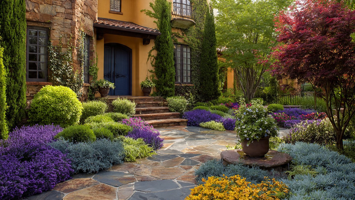
The color wheel serves as a fundamental tool in selecting colors for design. Complementary colors (colors opposite each other on the wheel) create strong contrasts when used together. For example, the combination of blue and orange or red and green can provide dramatic effects. Using contrasting colors strategically can highlight specific features or areas within your landscape.
Creating Stunning Color Contrast
1. Plant Selection
A. Choosing Contrasting Foliage
When selecting plants, consider their foliage color. Dark-leaved plants create striking contrasts against light-colored foliage. For example:
- Dark Purple or Black Plants: Such as Burgundy Black Lace Elderberry can contrast well with bright green or variegated plants.
- Silver or Gray Foliage: Plants like Dusty Miller can create a unique contrast with vibrant greens or deep reds, enhancing the overall visual depth of the landscape.
B. Flower Colors
Incorporating flowers into your landscape design can significantly enhance color contrast. Consider:
- Complementary Flowers: Pairing yellow daisies with violet irises creates a vibrant display.
- Textural Variations: Combining bold blooms like sunflowers with delicate blossoms like pansies can enhance dynamic contrasts.
2. Seasonal Considerations
A. Seasonal Planting
Planting with seasons in mind can create shifting color contrasts throughout the year:
- Spring: Bright yellows and pinks (like tulips and daffodils) can contrast beautifully with the fresh greens of emerging leaves.
- Summer: Rich reds and oranges can provide a warm contrast to deep blues in summer blooms like delphiniums.
- Fall: Autumn tones such as burnt orange and deep red create a warm palette against the backdrop of evergreen trees.
- Winter: The stark contrast of dark evergreens against white snow creates a monochromatic palette that emphasizes shape and form.
3. Utilizing Hardscape Elements
A. Pathways and Borders
Incorporate hardscape elements like patios, walkways, and borders to create ground-level contrast. For instance:
- Dark Stone Patios: These stand out beautifully against vibrant green grass.
- Light-colored Gravel Paths: They can effectively highlight striking plant colors, directing attention towards particular garden areas.
4. Texture and Shape Considerations
Color contrast is not just about hue; texture and shape play crucial roles. Combining various plant shapes and textures can create visual interest even when colors are similar.
- Use Spiky Plants: Combine them with rounded varieties to enhance the contrast. For example, pairing Blue Fescue (a spiky blue grass) with rounded cushions of Sedum can create striking visual contrasts.
5. Artistic Elements
Including art pieces like sculptures, fountains, or even garden furniture can enhance color contrast within your landscape. Consider integrating bold-colored art pieces against more natural landscapes for maximum impact.
Designing with Color Contrast in Mind
1. Focal Points
Identify focal points within your landscape where you want to draw attention. Selecting contrasting colors around these areas can highlight their importance. For example, placing a bright red flower bed near a calm blue water feature or a vibrant plant against a neutral fence can elevate the overall design.
2. Layering Color
Create depth in your landscape by layering colors in different planes:
- Foreground: Use bold colors to attract attention.
- Middleground: Incorporate contrasting colors with varying heights.
- Background: Opt for more muted colors for a subtle backdrop.
3. Color Schemes
Develop a well-thought-out color scheme before planting. Common schemes include:
- Monochromatic: Variations of a single color.
- Analogous: Colors that are next to each other on the color wheel (like blue, blue-green, green).
- Complementary: Using opposing colors for high contrast.
Maintenance for Continued Contrast
1. Regular Pruning and Trimming
To maintain vibrant contrasts, regular maintenance is crucial. Pruning can help to keep plants healthy and promote growth, encouraging a richer, more vibrant color display.
2. Seasonal Replanting
Consider seasonal rotation of annuals to keep color contrasts fresh. This approach allows for continual color transformation throughout different times of the year.
3. Healthy Soil and Fertilization
Healthy plants are vibrant plants. Ensure proper soil conditions and nutrients for optimal color display. Soil health can significantly impact foliage color, so regular testing and amendment are advisable.
Frequently Asked Questions (FAQs)
1. What are the best colors to use for contrast in landscape design?
The best contrasting colors often include complementary colors, such as purple and yellow, blue and orange, or red and green. These combinations create striking visual interactions.
2. Can color contrast work in small spaces?
Absolutely! In smaller gardens, using bold contrasting colors can create a sense of space. It’s essential to balance these colors with strategic placement and texture to avoid overwhelming the space.
3. How can I create contrast during different seasons?
To achieve seasonal contrast, choose plants that bloom at different times, incorporate foliage that changes colors, and select evergreens for winter interest. Mixing seasonal plants ensures color remains dynamic throughout the year.
4. Is it important to consider color contrast in hardscaping?
Yes, hardscape elements can significantly influence your landscape’s overall color scheme. Incorporating contrasting materials or colors can enhance the vibrancy of plants and create visual interest.
5. How often should I maintain my plants for optimal color contrast?
Routine maintenance, such as pruning, deadheading, and weeding, should be done regularly — typically every few weeks during the growing season. This helps maintain healthy plants and lively colors.
6. Can I achieve color contrast with only foliage plants?
Yes! Foliage plants can create stunning contrasts through variations in leaf color, texture, and shape. Experiment with different foliage plants to achieve a colorful and visually intriguing landscape.
7. Are there any resources to help with color selection?
There are numerous resources available including online color wheels, landscape design software, and local gardening clubs. Visiting botanical gardens can also provide inspiration and practical ideas for color combinations.
The effective use of color contrast can turn an ordinary landscape into a breathtaking visual masterpiece. By understanding color theory, selecting the right plants, considering hardscape elements, and planning with seasonal changes in mind, you can create a dynamic, inviting, and stunning landscape for years to come. Whenever in doubt, remember: bold contrasts, engaging focal points, and thoughtful color combinations are key to successful landscape design.